2 Sisters 2 Cities

Image Map
  • About 2 Sisters 2 Cities
  • Recipe Index
  • Project Index
  • Contact Us
  • Like us on Facebook
  • Follow m on twitter
  • Follow k on twitter
  • Follow 2S2C on Pinterest
  • Follow 2S2C on G+
  • rss
  • e-mail 2S2C

Baby N’s Gray and Green-Themed Nursery

Posted by Meaghan Barry on September 23, 2013

So I started this post in early June and had hoped to finish it before Baby’s N’s arrival.  Fast forward three and a half months later and I am just getting to it!  I was still finalizing some of the details when Baby N decided to come a week early.  It took me up until this point to finally pull together the remaining elements of his gray and green-themed nursery.

While with T, I had a very specific theme in mind for his airplane-themed nursery.  However, for N, I really only had a color palette in mind…dark gray and green.  I spent a lot of time perusing the web to come up with this Pinterest board with this color scheme in mind.

gray nursery

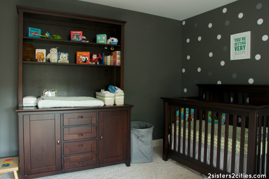
We ended up using furniture that we already owned to make up most of the nursery.  Since T is (hopefully) nearing the end of his diaper stage, we moved the diaper changing bureau to the nursery.  We also got T a “big-boy” bed and moved his crib to N’s room.  We also had a mahogany dresser from our old master bedroom that we were no longer using.  Our one furniture splurge was the new white glider from Land of Nod.

white glider

This room was previously our guest room and was painted a light green.  I wanted something a bit more dramatic for the nursery and I fell in love with a color called Kendall Charcoal (Benjamin Moore HC 166.)  I was a bit worried that it would be a little too dark, especially for a nursery, but I love the way the walls turned out.  It contrasts so nicely with the white and green.

quilt

My favorite addition to the room is the beautiful gray and green quilt that K made for Baby N.  It’s stunning and perfectly matches the room even though she had never seen it in person until her recent visit.  I love all the fabric she used, especially the cute little elephant.  It truly makes the room feel complete.  K took pictures of her progress on the quilt as she was making it and will be writing up a post soon with her tutorial.  I am so impressed with how it turned out and it puts a smile on my face every time I enter the room!

dots

My second favorite part of the room are the white and silver dot decals (also from the Land of Nod.)  I can attest that they are very easy to remove and reuse…I ended up changing it up three times before I was fully satisfied with the results (a big shout-out to sister M, K, and my husband who helped me adjust them and made sure they were random enough!)

you are getting very sleepy

I also spent some time on Etsy looking for wall art for the nursery.  I still want to buy one with Baby N’s birth info (weight, date, etc.), but I love the ones I have hanging up so far.  My favorite one is the letterpress print above the bed that says “You are getting very sleepy.”  It’s a family joke that my father always used to tell me that I looked sleepy when I was a baby and would just put me down and I would fall asleep.  Wishful thinking that my kids would be like that…Baby N is a pretty terrible sleeper thus far.  Hopefully that will change in the near future!

pic 7

Gray and Green-Themed Nursery Source List:

Crib and Changing Bureau- Romina Charisma
Dresser- Pottery Barn
Glider- Land of Nod
Side Table- Target
Book Caddy- Land of Nod
Knit Pouf- Land of Nod
Crib Sheets  & Skirt- Pottery Barn
Roman Shades- Pottery Barn
Green Lamp- Target
Dot Decals- Land of Nod
You are getting very sleepy” print- Etsy
“ABC/I Love You” print- Etsy
“Climb Trees” print- Etsy
Paint Color- Benjamin Moore Kendall Charcoal (HC 166)

sister m signature


Filed Under: Design & Decorating Tagged With: baby n, decorating, gray, green, nursery, nursery design idea

Christmas Mantel Guest Post at My Way Home

Posted by 2 Sisters 2 Cities on December 7, 2012

DIY Christmas mantel

In addition to my blue and silver holiday wreath that I posted about yesterday, I also decided to incorporate this color palette to decorate my mantel for Christmas.  I have a few DIY projects that I made for the mantel being featured today on Wayfair’s blog, My Way Home.

DIY scalloped felt trees

The first thing I made for my Christmas mantel were these felt scalloped trees inspired by ones I saw in the Land of Nod catalog.  They were really fun to make and are easily customizable with any color scheme you want to do with your holiday decor.  This could also be a great project to make with kids!

Banner reads All is Bright

The second project was the holiday banner mantel that read “All is Bright.”  I wanted to use a message that would remind myself to enjoy all the special moments of the holiday season.

I also made the wooden letters that spelled J-O-Y, the wreath, and the felt stockings.  The letters and the wreath all got hit with a couple applications of silver spray-paint.  I used the leftover felt from the scalloped trees to just cut out mini stockings to match the rest of the Christmas mantel.

To access my tutorials and more details on all these projects, check out my guest post at My Way Home.  I also got to pick five items from the Wayfair website to complement my post- I had so much fun picking them out.  I would love it if you could stop by and leave a comment with your thoughts on my post at My Way Home!

K and I will be back very shortly with our nice remaining Christmas cookies for our 12 days of Christmas Cookies series.  We have been busy baking away!  For our first three cookie recipes, see the links below:

Day 12: Twelve Oreo Truffles
Day 11: Eleven Mini Pecan Pie Bites
Day 10: Ten Crisp Toffee Chocolate Bars

sister m signature


Filed Under: Crafting & DIY, Design & Decorating, Guest Bloggers Tagged With: all is bright, blue, christmas, Christmas DIY, Christmas mantel, DIY, diy project, felt scalloped trees, gray, guest post, holiday banner, holiday banner mantel, holiday mantel, Land of Nod, My Way Home, silver, silver wreath, wayfair

DIY Halloween Pennant Banner

Posted by 2 Sisters 2 Cities on October 26, 2012

Halloween Pennant Banner DIY Tutorial

I realized the other day that we have hardly any Halloween decorations in our house besides our cheapo plastic pumpkin that holds candy.  I didn’t want to spend too much money considering Halloween is only five days away so I decided to just focus on sprucing up our fireplace mantle.  The Halloween pennant banner is really easy to make and I’ve got a free printable below so you can use the same spooky letters if you want.

Halloween decorations

I picked up a few other decorations for the mantel earlier today.  The glittery pumpkins were 50 cents a piece at Michael’s.  I found the owl at Marshall’s for less than $10.  My husband and baby T and always complaining that an owl outside keeps them up at night so I thought he would fit in perfectly to our Halloween display.  I bought the baby pumpkin a few weeks ago. All the other pumpkins I bought  at the time have since rotted so we need to pick up a few more this weekend for carving.

Halloween Pennant Banner Tutorial

Materials Needed:

  • Orange, black, and white cardstock
  • A few yards of rickrack or another type of string/ribbon
  • Double-sided tape
  • Masking Tape
  • Large scallop punch (this step is optional if you don’t have one)
  • Ruler
  • Scissors
  • Pencil
  • Halloween candy to munch on

Directions:

Use a ruler to make a template for the pennant flags.  Mine measured out 6 inches on the short side and 9.5 inches on the two long sides.  Sketch out the measurements with a pencil and use scissors to cut out the flag.  Use this flag to trace 13 additional flags alternating the paper color if desired.  Cut out the rest of the flags.

Use a scallop punch to make 14 scalloped circles (Alternative idea: if you don’t have a scallop punch, you could use a can to trace a large circle.)  Print out the font templates below if you want to use the same message and font on my banner.  (For Macs: Save the two jpeg files and open it in Preview to print.)  If you want to create your own message or use a different type of font, I highly recommend checking out picmonkey.com.  They have a lot of different Halloween fonts right now as well.  Trace a small circle (I used a small can) over each letter and cut out the 12 letters.

templates for the letters T-R-I-C-K-O Template for the letters T-R-E-A-T-R

Use double-sided tape to attach the scalloped circle and font circle onto the pennant flag.  Lay out the rickrack and tape the flags to the rickrack using masking tape.  Hang the Halloween pennant banner on your mantel, step back, and admire!

sister m signature


Filed Under: Crafting & DIY, Design & Decorating Tagged With: DIY, diy project, diy tutorial, halloween, halloween pennant, mantel, mantel decorations, pennant, pennant banner

Master Bathroom Paint Color Reveal

Posted by 2 Sisters 2 Cities on September 27, 2012

About six months ago, I did a post about six Benjamin Moore paint colors we were considering for our master bathroom paint color.  We were deciding between Labrador Blue (1670), Amsterdam (AF-550), Jamestown Blue (HC-148), Aspen Skies (1656), Azores (AF-495), and Atmospheric AF-500.  We ended up going with Jamestown Blue.  We really needed our master bathroom paint color to pop against the neutral tiles and the beige/purple/gray combo that it was painted before just wasn’t cutting it.  We are in love with the results!  It feels like a completely different bathroom now.

Without further ado, here are the before and after photos:

Another before and after shot from another angle:

From another angle.  The beach picture is from HomeGoods and the mirror is from West Elm:

I found these cute bath mats from Target- I love how the shade of blue in the rugs is so similar to the wall color.

What do you think of the results?  Have you changed the color of a bathroom in your house?  What were the before and after colors?


Filed Under: Design & Decorating Tagged With: benjamin moore, benjamin moore jamestown blue, Benjamin Moore paint, decorating, jamestown blue, master bathroom, master bathroom paint colors, paint colors, reveal

Ikea Expedit Playroom Storage Reveal

Posted by 2 Sisters 2 Cities on July 26, 2012

I wanted to follow-up on my Ikea Kitchen Tour post and show you how I used the Ikea Expedit bookshelves in our playroom.  I originally wanted to build some type of built-in bookshelves in our playroom, but after finding a few ideas on Pinterest and other blogs, I realized the Ikea Expedit bookshelves would do the trick (and would be much more budget-friendly!)

I did a little measuring in the playroom and determined that three of the 2 shelves by 4 shelves Expedit bookshelf would be perfect for the space.  I wanted to include some baskets in the space because so many of my son’s toys come with so many parts (train sets, blocks, Duplos, etc.)  I loved how the PJÄS baskets fit perfectly in the Expedit shelves.  I originally bought 4 of the baskets, but I bought 8 more when I went back last week because I liked how they looked so much.

Without any further ado, here’s our Ikea Expedit playroom reveal:

Also, here’s a close-up of the Kritter table and chair that we bought at Ikea a few months ago:

Have you used the Ikea Expedit bookshelves in your home?


Filed Under: Design & Decorating, Organizing Tagged With: Ikea, ikea expedit, ikea expedit bookshelf, ikea playroom, pjas baskets, playroom, playroom decorating, playroom organization

Ikea Kitchen Tour

Posted by 2 Sisters 2 Cities on July 19, 2012

I took another trip to Ikea today (mosey on over to this link if you want to read about the adventure from my first trip.)  I needed to pick up a few Ikea PJÄS baskets to finish up the playroom and some of the Vivan curtains that Young House Love always references on their blog.  I decided to snap a few photos throughout my shopping experience and do an Ikea Kitchen Tour post.  I am not in process of renovating my kitchen (in fact, it’s my favorite room in the house), but I always love to check out different design ideas.  Here are a few of my favorite kitchens and kitchen products from Ikea that I wanted to highlight:

Here’s the first kitchen I saw in the showroom.  I love the apron front/farm-style sink mixed with the contemporary amenities.

The next kitchen I stumbled upon was my favorite one of all of them.  I loved how everything was white and the backsplash was beyond amazing.  I seriously wish I had tidied up those stools before I took the photo, but that might have looked a little crazy (here’s my number, so call me, maybe.)

I also loved the sink in the above kitchen.  Here’s the close-up:

How much fun would it be to cook and entertain at this huge island?


Here are a few other Ikea kitchens I saw in the store:

Here’s a double apron-front sink they also stocked- I’m coveting this:

I’m also in love with all of these contemporary faucets:

Our trip got cut a little short in the Marketplace section.  We were today’s meltdown of the day at Ikea Stoughton (I swear, last time I saw so many kids throwing major temper tantrums in Ikea.)  We got out of there as fast as we could at that point so I was not able to take as many kitchen product photos as I hoped.  I did pick up some colorful Fantastisk paper napkins for future parties.  I also snapped a quick shot of these aqua and white plates- perfect for a summer beach house:

These glass containers would be perfect for pantry storage (at an affordable price!)  I always see so many beautiful images on Pinterest of pantries stocked with glass jars with every type of rice, pasta, etc.  Someday…

And I meant to pick up this Stockholm bowl, but totally forgot to look for it in the downstairs marketplace.  Guess I’ll have to schedule another trip to Ikea soon!

 I do have to say that despite baby T’s major meltdown, Ikea is an incredibly family-friendly place to shop.  It all started when we pulled into our special family parking spot:

There were lots of clean bathrooms with changing tables.  The changing table even had its own disposable liners- seriously moms, when do you ever see those Koala changing stations actually stocked with paper liners?  There was a small baby sink in the bathroom (although T insisted on touching every surface of the little sink, which probably negated any hand-washing done there):

 We also enjoyed a nice lunch in the Ikea restaurant.  I didn’t notice it until after, but they have special carts that can carry up to 3 trays at a time.  That would have been a lot easier to manage rather than trying to balance T in one arm and a tray in another.  The cafeteria was well-stocked with high chairs and they sold baby food there if you had a younger baby.  They also had a baby food warming station.  T especially enjoyed the juice boxes:

Thanks for joining me on my Ikea Kitchen Tour!  What do you think of the Ikea kitchens?  Would you ever consider getting an “Ikea kitchen?”  Do you consider Ikea to be a particularly family-friendly store?  Have you ever witnessed (or been part of) an epic meltdown in Ikea?


Filed Under: Design & Decorating, M's post Tagged With: adventures in ikea, Ikea, ikea family-friendly, ikea kid-friendly, ikea kitchen tour, ikea stoughton, ikea trip, kitchen design, kitchen design ideas, kitchens

Made from Pinterest: DIY Hydrangea Wreath

Posted by 2 Sisters 2 Cities on May 31, 2012

Our front door had been looking pretty lonely since January when I took our Christmas wreath down.  I had not been able to find a spring wreath that I liked, so I started scouring Pinterest for some ideas.  I knew I had found just what I wanted when I saw this pin – a hydrangea wreath.   Hydrangeas are one of my favorite flowers and they were the main type of flower I used for my wedding.  Our new house came with three hydrangeas in the yard and I can’t wait to see what lovely shade they will bloom in.

Since this is the week of making stuff found via Pinterest (see Basil Lemonade and Frozen Cupcake S’mores), I knew I had to get this project done this week.  I bought all the supplies at Michael’s to make this.  I am so pleased with the results- it gives our front door the perfect punch of color. For the complete step-by-step tutorial on how to make this hydrangea wreath, see Vanessa Christenson’s blog V & Co.

What are some of your favorite projects that have been inspired from Pinterest?


This post is linked up at:
    The Shabby Nest


Filed Under: Crafting & DIY, Design & Decorating Tagged With: DIY Hydrangea wreath, DIY wreath, hydrangea wreath, inspired by pinterest, made from Pinterest, pinterest, pinterest DIY project, Pinterest wreath, wreath for front door

Painting Our Dining Room Furniture: After Pictures

Posted by 2 Sisters 2 Cities on April 16, 2012

A couple of months ago, I wrote a post how we were in process of decorating our dining room and decided to paint our dining room furniture.  I wanted to follow-up and show how our furniture looks now that the painting has been completed.  We are still in process of working on the rest of the dining room, so stay tuned for more pictures of the rest of the room.

First off, here are the before and after pictures of our dining room table (those are additional table leaves in the background):


Then, we had the grandmother clock painted:

And my favorite piece of all, the buffet table:

I love how all three pieces of furniture turned out!  The slate gray color is just what I had in mind.  I know some people would not consider painting furniture, especially family heirlooms like the grandmother clock, but it was the right decision for us.  The pieces were a little too traditional for what we wanted and the clock would have likely ended up in storage in our basement if we didn’t change it up a little.  If you can’t make a piece of furniture fit your style, what is the point of holding on to it?  Check out Painted Pretty for more painted furniture ideas…they do such a great job!  If you live in Boston, they are at the SOWA vintage market every Sunday.

Have you painted a piece of furniture in your house?  Were you happy with the results?


Filed Under: Design & Decorating Tagged With: after pictures, before and after pictures, buffet table, decorating, dining room, dining room after pictures, dining room table, grandmother clock, painted furniture, painting furniture, slate gray furniture

Monday Morning Blues- Picking a Paint Color For Our Master Bathroom

Posted by 2 Sisters 2 Cities on February 27, 2012

The final master bathroom paint color reveal has been posted- check out this post to see what the painted bathroom looks like!

I have been making a lot of trips to our local hardware store lately to pick up paint swatches and samples.  I’ve pretty much come to one conclusion- there are way too many colors to choose from!  It’s so overwhelming.  We finally narrowed down on a couple colors for our master bathroom and bought the mini sample jars.  However, when we painted some samples on the wall, it was not what we were expecting at all.

I ended up trying 6 different Benjamin Moore samples until we found our perfect shade of blue for our bathroom:

The colors are:
1. Benjamin Moore Labrador Blue 1670: This blue is a stunner!  I really like it, but it’s our runner-up for bathroom paint color.  I may try to use it in another room in the house.  I read online that this is the stairway and hallway colors in Phil & Claire’s house on Modern Family.
2. Benjamin Moore affinity- Amsterdam AF-550: This was actually an old sample I had from our condo in the city.  I was looking for a gray shade at the time and I eliminated this color because I felt like it had too much blue in it.  This time it got eliminated because it was not blue enough.  Cheer up Amsterdam AF-550, I think I have another room in the house where you might work perfectly!
3. Benjamin Moore Historic Color- Jamestown Blue HC-148: We have a winner!  The husband and I both loved this blue.  I think it will look great against the tile and cabinetry.  Hopefullly it will be the perfect shade to cheer up this bathroom! (edited: the final results of Jamestown Blue can be seen here!)
4. Benjamin Moore Aspen Skies 1656: Looking at the paint swatch, I thought this was the paint color for the bathroom.  On the wall, it was way too bright!  Even though it may seem like a waste to spend $4 a piece on all those mini samples, it saved us a lot of money in the end because I ended up not liking this paint color at all.
5. Benjamin Moore affinity- Azores AF-495: I bought samples of #5 and #6 for our guest bathroom, but decided to throw them up there to show another couple of options.  They both have a bit more green in them.  I think they are both great colors, but my heart is set on a blue master bathroom.
6. Benjamin Moore affinity- Atmospheric AF-500: This paint looks really similar to #5, but it’s a tad more gray than Azores.

Here’s another angle of the paint samples:

I’ll post full before and after photos once we are done painting the bathroom.  For now, it’s off to the hardware store to pick up some more swatches.  How do you go about picking a paint color?  Share your tips and strategies in the comments!


This post is linked at:


Filed Under: Design & Decorating, M's post Tagged With: bathroom paint colors, bathrooom paint color, Benjamin Moore paint, decorating, paint samples, painting, picking a paint color

Our New (Mini) Kitchen Table

Posted by 2 Sisters 2 Cities on February 18, 2012

Yesterday I took my very first trip to Ikea.  I had a lot of fun checking it out, but it was definitely overwhelming.  I had scoped out their website beforehand and had pretty much decided what I wanted already, but I wanted to see it in person first to make sure the quality was acceptable.  The main purpose of the trip was to pick up a few things for Baby T, but I’m already planning a return trip back to pick up some more things for the house.

Baby T has a new found love of climbing.  His favorite thing to climb however is our kitchen table.  He pulls himself onto a chair and then the table (and he can do this very quickly.)  I decided to get him a children’s size table where he could eats snacks and play with toys.  I didn’t want to spend too much on the table since he’ll outgrow it pretty quickly and Ikea had just the thing…the Sundvik table and matching chairs:

How cute is that little train set as well?  I was really impressed with the quality and price of their toys!  The Lillabo train set was only $9.99 and has 20 pieces (the picture does not include the bridge and 4 additional curvy pieces.)  I also got him some of the Duktig kitchen accessories to go with his play kitchen he got for Christmas.  In addition, I also picked up a few small wooden toys, the drawing paper roll, and the Busa play tunnel.  I probably went a bit overboard, but I could not get over the prices!

Here’s what the children’s table looks like next to our full-sized black kitchen table:

Hopefully the mini table is the antidote we need to solve our kitchen table climbing problem!
-m
Related Posts Plugin for WordPress, Blogger...


Filed Under: Design & Decorating, M's post Tagged With: baby, baby t, baby's nursery, children's table, getting ready for baby, Ikea, kitchen, Sundvik children's table

  • 1
  • 2
  • Next Page »

Recent Posts

  • Easy Holiday Office Party Tips
  • 5 Steps to an Easy Football Party
  • Gingerbread Biscotti
  • Holiday Coffee Bar and Thanksgiving Recipes
  • Soft Sugar Pumpkin Cookies
  • Cinnamon Sugar Apple Cake
  • Hello Pumpkin Season!
  • Make Your Own Milkshake Party!
  • Mama’s Pickles
  • S’more Cookies

Categories

  • About 2 Sisters 2 Cities (7)
  • Books (8)
  • Crafting & DIY (22)
  • Design & Decorating (15)
  • Gardening (5)
  • Giveaway (14)
  • Guest Bloggers (8)
  • K's post (46)
  • K's Recipes (191)
    • K's Desserts (75)
    • K's Entrees (23)
    • K's Sides (24)
  • M's post (72)
  • M's recipes (167)
    • M's Entrees (21)
    • M's Sides (14)
    • M's Desserts (30)
  • Organizing (7)
  • Party Ideas (49)
  • Uncategorized (1)
  • Vacation (12)
Stitch Fix

Archives

Blogroll

  • Annie's Eats
  • Bake at 350
  • Baked Bree
  • Boston Harbor Beacon
  • Confections of a Foodie Bride
  • Cook Like a Champion
  • Erin’s Food Files
  • Forever and a Recipe
  • Framed Cooks
  • Oh Happy Day
  • On Common Ground
  • Pennies on a Platter
  • Pink Parsley
  • Recipe Girl
  • Sally's Baking Addiction
  • Simply Scratch
  • The Curvy Carrot
  • The Pioneer Woman
  • Tidy Mom
  • Two Peas & Their Pod
  • What’s Gaby Cooking
  • Young House Love
Increase your website traffic with Attracta.com

grab a 2 sisters button!


Copyright © 2014 ~ 2 Sisters 2 Cities | Blog Design by Minx Design